Endeavour Energy response vehicles adopt Hi-Vis markings and highly effective synchronised warning lights


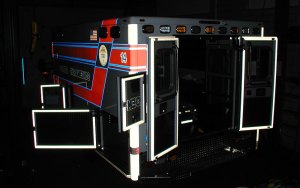
Endeavour Energy has updated the markings and warning lights on its fleet of response vehicles. They now display Hi-Vis fluorescent markings and a fully synchronised pattern of amber warning lights that simultaneously flash through 360 degrees and are visible from any viewing angle around the vehicle.

Ambulance Visibility was engaged by Endeavour Energy to make scientifically based recommendations on visual warning methods and draft a new marking/warning light specification for their response vehicles. Redline Fleet completed the lighting fit-out and a link to their YouTube video appears below.

The approach to the redesign by Endeavour Energy was unique. The Energy provider trialled three different arrangements of markings and warning lights so that staff could assess how effective each style was under real world conditions, including operations on suburban, rural and expressway roads, both day/night and under different weather conditions. The lead design [of the three designs] incorporating fluorescent/reflective markings with simultaneously flashing amber lights was voted by staff as the most visible and effective layout under all conditions.

The positions usually allocated for markings and warning lights on the response vehicles were unavailable due to the location of the existing equipment boxes and racks. By necessity, this encouraged innovative solutions to ensure that 360 degree visibility and viewer interpretation of the vehicle’s purpose, size and orientation were not compromised, especially at road incidents and other high-risk situations.

After the trials were completed, the staff readily agreed with the scientific findings that large panels of fluorescent/reflective colour combined with a synchronised lighting solution provided significantly greater levels of visual conspicuity and recognition by the public. The synchronised light-heads flashing simultaneously in a double-flash pattern around the vehicle were found to be superior to random flashing or alternating light patterns under all types of road and weather conditions. This finding is in direct contrast to the popularity of the current trend supporting alternating lighting displays on emergency vehicles (particularly for bi-colour warning lights).

The synchronised lighting pattern provides unity and allows Endeavour Energy vehicles to be readily seen and identified when parked alone in traffic or easily differentiated from other vehicles parked alongside or nearby at an incident. The simultaneous flash pattern with its distinct off period also increases the opportunity for passing drivers to discern and avoid people walking around the Endeavour Energy vehicles in the dark at night.

Posted in Emergency vehicles, Fluorescent colours, High Visibility, Markings, Reflective, Research, Warning Lights | Tagged , , , , , , , , , , , | Leave a comment

New high-visibility patrol cars for Western Australia Police


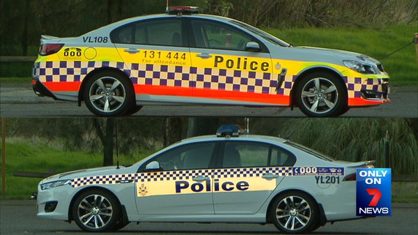
WA Police (WAPOL) recently announced the completion of a project to upgrade the markings, warning lights and sirens of not just the Highway Patrol cars, but all vehicles in the fleet. The project team reviewed current best worldwide practice and translated the findings onto their vehicles.

Western Australia Police high-visibility patrol vehicle

Old and new Western Australia Police high-visibility patrol vehicles

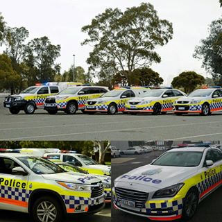
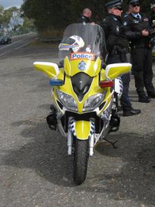
While a few police forces in Australia have begun to affix fluorescent colours to their vehicles, WAPOL is the first to fully integrate a multicolour Hi-Vis marking scheme with state-of-the-art LED warning lights and sirens with an expanded frequency range.

The new Hi-Vis markings displayed on a range of WAPOL vehicles

The new Hi-Vis fluorescent markings displayed on a range of WAPOL vehicles


Posted in Emergency vehicles, Fluorescent colours, High Visibility, Markings, Police, Reflective, Uncategorized, Warning Lights | Tagged , , , , , , , , , , | Leave a comment

Conflicting emergency vehicle pattern markings merge to create camouflage effects


Many earlier posts have described the problems associated with affixing a range of different patterned markings (especially rear chevrons) onto emergency vehicles.                 The problem is made even worse when a number of local agencies independently decide to display different pattern styles to brand their vehicles in an attempt to highlight their agency’s individuality. It is only when all the different vehicles pull-up alongside one another that the full impact of the pattern confusion becomes obvious.

Pattern markings conflict to induce camouflage effects at an accident scene

Pattern markings conflict to induce camouflage effects at an accident scene

The image above image clearly demonstrates the conflict effects with a mixture of diagonal chevrons in red/white or yellow/red colours alongside the bands of blue and red chequers. The patterns are so strong that they continuously distract the observer by pulling and drawing the eye to different areas within the scene. This effect makes the outline and shape of each vehicle much harder to discern. Subsequently the observer’s ability to make sense of the scene is greatly reduced. The landscape background shown is plain but another more complex streetscape littered with cars, signs and buildings would visually complicate the entire scene even further.

The only stand-out elements are the plain yellow-green fluorescent arch on the rear of the fire appliance and the orange sill stripe on the ambulance, both of which reinforce the important visual strength of solid fluorescent coloured markings on vehicles. The image also demonstrates the weakness of red/white chevrons when compared to the universally accepted colour combination of red and yellow chevrons angled at forty five degrees.

Enough said for today……..try to stick to simple solid colour designs for vehicle markings and other drivers approaching an accident scene will appreciate your effort.

Posted in Ambulance, Chevrons, Emergency vehicles, EMS, Fire, Fluorescent colours, High Visibility, Markings, Police, Reflective, Uncategorized | Tagged , , , , , , , , , | 3 Comments

Fluorescent marking creep is slowly improving the conspicuity of Australia’s emergency vehicles


It has taken many years but fluorescent markings are finally beginning to appear on more and more police, fire and ambulance vehicles around the country. While the response vehicles of some emergency services still wear the traditional Sillitoe scheme or a stylised variation of the checkered pattern, their vehicles are slowly being enhanced by the addition of fluorescent stripes and panels – usually in yellow-green or red/orange colour schemes.

HiVis MC

Colour, pattern or lighting creep refers to the gradual conversion over time of new marking or lighting styles onto emergency vehicles.  Creep is seen when agencies that have previously rejected changes to their markings begin to display small modifications to the colours/patterns/warning lights on vehicles or alternatively they fully adopt new designs that are similar to other national or international agencies. The changes are usually slow but often driven by changing attitudes within an agency or an acceleration of the popularity of a design. Occasionally a rapid industry-wide cascade (rather than a creep) can be brought about by revised regulations e.g. chevron markings in the US after NFPA 1901 and NFPA 1917 were published or the recent change to yellow body colour + Battenburg markings on St John’s ambulances in New Zealand.

Continue reading

Posted in Ambulance, Battenburg, Emergency vehicles, EMS, Fluorescent colours, High Visibility, Markings, Motorcycles, Police, Reflective | Tagged , , , | 2 Comments

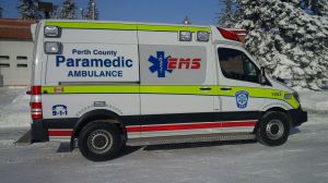
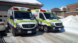
New Perth County EMS Sprinter ambulances


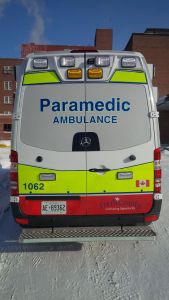
Michael Crawley from Perth County, Ontario has sent me some photos of their new Sprinter ambulances with high-visibility fluorescent/reflective markings.

“We now have 3 Mercedes sprinters in our fleet and have had numerous positive comments about the graphics. Just wanted to thank you again for all your help……”

Thanks for the great photos Michael. You can follow the Perth County EMS Twitter feed at https://twitter.com/perthcoems

Perth County EMS Canada - Sprinter Ambulance - High Visibility - Rear viewPerth County EMS Canada - Sprinter Ambulance - High Visibility - Side view


Perth County EMS Canada - Sprinter Ambulance - High Visibility - Front View

Posted in Ambulance, Emergency vehicles, EMS, Fluorescent colours, Markings, Reflective | Tagged , , , , , , | Leave a comment

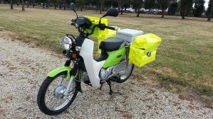
Australia Post trades up to high conspicuity lime-green motorcycles


Australia Post recently announced that all new ‘Postie’ delivery motorcycles would be coloured lime green and white with fluorescent green mail panniers. The iconic ‘red rattler’ 90cc and later 110cc motorcycles were legendary for their toughness and durability with retired postie bikes always being hot items at disposal auctions. The posties are also decked out in fluorescent green to further enhance rider safety. Australia Post is also using lime green electric bicycles for inner city postal rounds….well done Australia Post.

AP bike5Australia Post motorbike

Posted in Fluorescent colours, High Visibility, Markings, Motorcycles | Tagged , , , , , , , , | Leave a comment

Get out of the way: An article on the history of ambulance warning lights


Beacon

This article was published on Gizmodo Australia in early June and provides a brief history of warning lights before discussing the important research undertaken by Michael Flannagan and his associates at the University of Michigan’s Transportation Research Institute. I have discussed Michael’s comprehensive work on emergency vehicle warning lights before in this blog and as part of my PowerPoint presentations. This article is a gentle introduction to the raw research which is a highly recommended read and available from the AV website or by direct download using the links below

Read the Gizmodo article by Rachel Swaby – HERE

Color Identification in the Visual periphery: Consequences of Color coding of vehicle signals – Sivak, M. Flannagan, M. Miyokawa, T. Traube, E. – UMTRI, July 1999 CLICK HERE

Effects of Warning Lamp Color and Intensity on Driver Vision*
Flannagan, M.A Blower, D.A Devonshire, J. – UMTRI, October 2008
CLICK HERE

Posted in Ambulance, AV Reference Library, Emergency vehicles, EMS, Fire, Police, Warning Lights | Tagged , , , , | Leave a comment

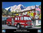
Portraits of Hope on Aspen emergency vehicles


Colors of Hope 1 - ColoradoEvery now and again my friend and colleague Howard Paul at EMSAC sends me interesting links or photos from Colorado and these really brought a smile to my face.

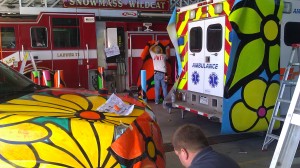
Portraits of Hope a national non-profit art and social service program founded by brothers Ed Massey and Bernie Massey, will transform the entire fleet of emergency vehicles in the upper Roaring Fork Valley with colorful flower murals hand-painted this winter and spring by some 2,000 children and adults, half of whom are children who participated through local schools and social service organizations.

 The bold designs will be on display for a five-month exhibition on the vehicles of the Aspen Volunteer Fire Department, Snowmass-Wildcat Fire Protection District, Aspen Ambulance District, and Mountain Rescue Aspen….This historic endeavor is Portraits of Hope’s debut in Colorado and the first time anyone, anywhere, has transformed operational emergency rescue vehicles into public art.

The project, which will make over 38 vehicles into a collective work of art, is the culmination of the efforts of nearly 2,000 children in schools, hospitals, and social service programs — and more than 250 adult volunteers, including parents, firefighters, rescue personnel, and civic-minded members from local communities.

Read more in the Aspen Business Journal – HERE

Colors of Hope 2Colors of Hope 3

Posted in Ambulance, Emergency vehicles, EMS, Fire, Markings, Police, Uncategorized | Tagged , , , , , , , , | 3 Comments

AV is back on the road!


Write-On2

Due to my heavy workload over the last few months the AV blog has endured a forced sabbatical. Although I am still quite busy the blog posts have returned…..

Posted in Uncategorized | Leave a comment

MONOC – New siren safety video for emergency for Police, Fire, Ambulance/EMS responders


The Monmouth Ocean Hospital Service Corporation (MONOC) operating in New Jersey has released a short video that can be viewed and downloaded from their website.Monoc - 011

The video briefly summarises United States EMS crash statistics and goes on to discuss the benefits of a tiered response. The video includes a simulated lights & sirens response down an urban street that clearly demonstrates how soundproofing in modern vehicles along with background cabin noise from the car radio and air conditioner mask the siren sounds of an approaching emergency vehicle. The test vehicle is stationary and the ambulance is travelling at 25 mph but the video notes that wind and road noise produced by an average subject vehicle at speed reduces siren penetration even more than shown in the demonstration.

The video can be viewed on the MONOC website or downloaded free of charge as a Windows, Quicktime or iPad file (up to 300MB depending on format).

View and download the video – HERE
View the MONOC website – HERE
Read more siren reports from the AV Reference Library – HERE
Read another blog post on sirens  – HERE

Posted in Ambulance, Emergency vehicles, EMS, Fire, High Visibility, Markings, Police, Reflective | Tagged , , , | 1 Comment

Ohio DOT add green warning lamps to snowploughs (snowplows) – HiVizTV


Changes to state legislation now permits snowploughs in Ohio to be fitted with any colour warning lights except red and blue. The state’s 1500 snowploughs will be progressively retrofitted with green flashing lamps alongside the current fHiViz-TV icon - www.ambulancevisibilitylashing amber and white lamps. While green lamps are considered to be more easily detected (especially in peripheral vision) they are not usually fitted to emergency vehicles as green has the traditional connection with traffic lights as a GO colour rather than the red STOP or amber CAUTION colours.

The Ohio DOT have fitted the green flashing lamps in an attempt to reduce the possibility of rear-end collisions with snowploughs operating throughout the state. It will be interesting to see if the changes actually translate into a decreasing number of  rear-end collisions.

CLICK HERE  for video

Ohio Snowplough

Posted in Emergency vehicles, High Visibility, Warning Lights | Tagged , , , , , , , , , , | Leave a comment

NSW Police highway patrol cars sacrifice officer safety with billboard graphics


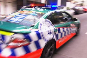
The October three-day weekend holiday in Australia has just passed and earlier in the week the New South Wales Police launched their “Operation Slowdown” safe driving campaign with a display of new vehicles and sobering interviews for the gathered media. This year the Highway Patrol cars featured a graphic scheme that would have to be the most complex and confusing billboard scheme ever seen over the years on any Highway Patrol vehicle in Australia . At the conclusion of the post published on 16 September 2012 I touched on how there seemed to be a common and long tradition of complex graphics and “boy racer” style markings affixed to Highway Patrol cars from the different states in this country.

Yet again the use of operational police vehicles as “community policing high-visibility billboards” has compromised the vehicle marking schemes. A Police highway patrolsuccessful marking scheme should enhance conspicuity and effectively transmit visual information to other drivers instead of making the vehicle more difficult to see and avoid by simply covering it in graphic public relations camouflage. Rapid recognition is one of the major critical elements that must be engineered onto the vehicle when placing markings on patrol cars, especially cars that are likely to be involved in emergent response or pursuits. Continue reading

Posted in AV Reference Library, Emergency vehicles, Fluorescent colours, High Visibility, Markings, Police, Reflective | Tagged , , , , , , , , , , , , , , , , , | Leave a comment

Almost right ….. finally a NSW Police PR Porsche displays an effective conspicuity band-of-colour


The New South Wales Police Force have taken possession of a $200,000 Panamera Sedan on loan from Porsche Australia. An article in the Sydney Morning Herald describes how the Porsche will be used as a non-operational community relations vehicle. Despite all the entertaining comments printed under the article and the outrageous street price we pay for these cars in Australia, the vehicle will certainly attract attention. This is due in part to a wide panel of fluorescent yellow affixed to the sides of the vehicle, a trend  I can only hope will migrate onto the operational vehicles in the fleet (minus the blue hybridised sillitoe check pattern that is currently displayed around the Porsche).

NSW Police Porsche

The markings on the Porsche have obviously been designed by a graphic artist so there is no way of knowing if the large panel of colour is intentional or accidental. Either way the wide stripe placement is effective and to be encouraged. The large logo forming the O in Police can even be overlooked. A solid panel of colour beneath the door sill would be preferable but you could live with the chequered pattern under the sill if the front and rear checks were removed and replaced with panels of fluorescent colour. Leaving the checquers on the rear would certainly increase the likelihood of the car being rear-ended.

Affixing fluorescent/reflective colours to the operational fleet would greatly benefit the safety of NSW police officers on the roads and also provide an increased sense of community presence just like this Porsche.

Posted in Emergency vehicles, Markings, Police, Reflective | Tagged , , , , , , | Leave a comment

Ambulance crash in Victoria, Australia – HiVizTV


HiViz-TV icon - www.ambulancevisibilityTwo Ambulance Victoria paramedics thankfully suffered only minor injuries after hitting a street barrier while travelling to an emergency case under lights and sirens. Bystanders attempted to release the crew by breaking the windshield, however they crawled to the back of the ambulance and opened the rear doors to escape.

The linked video demonstrates the effectiveness of the Mercedes Sprinter van unified body construction in maintaining vehicle integrity during an accident and rollover.

Link to video –
http://news.ninemsn.com.au/national/8543280/ambulance-crashes-rushing-to-job-in-melbourne

Ambulance Victoria crash

Posted in Ambulance, EMS, HiViz-TV | Tagged , , , , , , | Leave a comment

Law & Order – 2012 Police Vehicle Design Competition


The results of this year’s police vehicle marking design competition have been published by Law & Order magazine. I think this competition is a great idea and it brings together a wide cross-section of police vehicles from all over the United States. EMS could well do with a similar contest. The article opens with the following paragraph: Law & Order

“First and foremost, a police vehicle’s design should be about safety and identification. Agencies’ designs have also begun incorporating state, county and regional symbols, mission statements and mottos to represent the communities they serve.”

Unfortunately despite their best intentions, just about all of the winning layouts except the Best Rear Warning from North Richland Hills Police Department completely missed the safety and visibility goals. While black & white vehicles abound, some of the cars are obviously intended to be public relations or awareness vehicles used away from emergent response. However most vehicles shown continue to be actively used for working patrols. The difference between “high-visibility community awareness” has once again become confused with “high-visibility safety markings.” Significantly, the competition has drifted away from officer safety in vehicles to one of agency billboard design with visually confusing marking layouts. Continue reading

Posted in Battenburg, Chevrons, Emergency vehicles, Motorcycles, Police, Reflective | Tagged , , , , , , , , , , , , , , , , , | Leave a comment

Emergency Vehicle Markings Award of Excellence – Lethbridge Fire and EMS


Ambulance Visibility - Excellence award for Emergency vehicle markings - www.ambulancevisibility.comAlberta, Canada
Lethbridge Fire and EMS work in the City of Lethbridge which is about 220 kilometres south-east of Calgary.

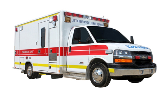
The latest markings on their ambulances display a fluorescent red waistline stripe with subordinate fluorescent yellow roofline and doorsill stripes. It can be challenging to design a red dominant scheme but Lethbridge have succeeded with an uncomplicated but elegant layout. Red marking schemes are often preferred by agencies working in snow regions. The waistline stripe incorporates a really unusual fine white line which splits the stripe on the cab in two but then drops to create two widely separated ECG complexes along a baseline. The dropped line allows PARAMEDIC UNIT in white to be written within the stripe. This is clever graphic design that transmits the EMS function to the viewer without overwhelming the safety message needed in a strong wide waistline stripe. Although the blue text facing forward is all upper case, it is sized to fit the vehicle and remains easy to read.
Lethbridge AmbulanceLethbridge EMSWhile the yellow stripes along the sides could be a little wider they remain in proportion to the profile of the ambulance. The reflective Lethbridge Fire & EMS text and the blue Star of Life on the sides are restrained in size but clearly legible on the large white groundspace of the patient care module. There do not appear to be white vertical reflective corner markings on the module or any A or B pillar contour stripes along the cab but these could all be easily added at any time.  Red and yellow chevrons on the rear cover only two thirds of the module and doors leaving room for text. Overall a job well done and the Lethbridge team should be congratulated for an excellent marking scheme.

Please feel free to comment and add your thoughts.

Posted in Ambulance, Emergency Vehicle Markings Award of Excellence, EMS, Fire, Fluorescent colours, High Visibility, Markings, Reflective | Tagged , , , , , , , , , , , , , , , , , , | 1 Comment

A ten-point toolkit for more effective emergency vehicle warning lights


This is the final part of three articles written for the Colorado EMSAC Star.
This article discusses ten vital elements in a tool-kit that provides the basis for an effective warning light layout suitable for use on any emergency vehicle.ACT Intensive Care Ambulance @ night - High visibility - www.ambulancevisibility.com

The first article in the EMSAC Star series discussed the Ambulance Visibility ten-point toolkit for applying markings to emergency vehicles. The second article looks at advertising agency visibility, Battenburg markings and the ongoing chevron debate.  All of the articles should be read alongside the PowerPoint presentation from the Colorado EMS Safety Summit held in 2010 that is available for download on the Ambulance Visibility website.

The first article is HERE
Read the second article – CLICK HERE
Here is the full PDF of the third and final article – HERE

……..I realised very quickly that I should listen to my own advice!

The Intensive Care ambulance was on its way to an urgent case, weaving though heavy traffic under lights and sirens. It approached my car, swiftly closing the gap and soon passed by. It now became glaringly obvious to me that the new flash pattern we had programmed into the light-bar was utterly confusing. As I continued on my thoughts turned to the many times I had spoken at conferences and presentations, each time emphasising the importance of undertaking careful testing of new warning lights or vehicle markings before committing the vehicles to the road.  The sinking feeling in the pit of my stomach soon began to shift to the mental arithmetic of how much it was going to cost to fix this problem with the light-bar….continue reading the article – CLICK HERE

Posted in Ambulance, Emergency vehicles, EMS, Fire, High Visibility, HiViz-TV, Police, Reflective, Research, SES, Significant & Important Blogs, Warning Lights | Tagged , , , , , , , , , , , | 1 Comment

Three new features coming to the AV Blog


Over the next few days you will see three new icons and categories appearing between the usual blog posts. There are a great number research papers, video clips and successful emergency vehicle marking layouts that deserve to be recognised even though they do not make it into the longer mainstream postings. A different research study from the AV Reference Library collection will be posted about every 7-10 days. Interesting and informative video clips will be added as they become available and a new Award of Excellence will recognise emergency service agencies that excel by designing their vehicle markings to meet high-level visibility and conspicuity ratings.

Below are the new icons that will appear with the blog posts. I hope you continue to enjoy the AV blog and these great additions to the Ambulance Visibility portfolio of websites.

Ambulance Visibility - Excellence award for Emergency vehicle markings - www.ambulancevisibility.comWeekly Research Spot Icon - www.ambulancevisibility.comHiViz-TV icon - www.ambulancevisibility

Posted in Ambulance, AV Reference Library, Chevrons, Emergency Vehicle Markings Award of Excellence, Emergency vehicles, EMS, Fire, Fluorescent colours, High Visibility, HiViz-TV, Markings, Police, Reflective, Rescue, Research, SES, Significant & Important Blogs, Uncategorized, Warning Lights, Weekly Research Spot | Tagged , , , , , , , , , , , , , , , , , , , , | Leave a comment

University of Ohio Driver Safety and First Responder Research – HiViz TV


HiViz-TV icon - www.ambulancevisibilityThe Russ College of Engineering and Technology at the University of Ohio is using a new driving simulator featuring the front half of a Ford Focus to study the most effective combination of colors, reflective stripes, lights and logos for emergency vehicles. The two-year research was funded by a US$245,000 grant from the US Department of Justice in 2010. Assistant Professor Deborah McAvoy is the director of the project and in the video below she talks about the new simulator and the project in more detail.  An article by the Ohio University Office of Research Communications describes the new simulator and some of the study results already flowing from the simulation environment.

Posted in Ambulance, Emergency vehicles, EMS, Fire, Fluorescent colours, High Visibility, HiViz-TV, Markings, Police, Reflective, Research | Tagged , , , , , , , , , , , , , , , , , , , , , , , , , , , , , , | Leave a comment

Evaluating new trends in emergency vehicle markings


This is the second part of three articles written for the Colorado EMSAC Star. The first article in the series discussed the Ambulance Visibility ten-point toolkit for applying markings to emergency vehicles. This second article looks at advertising agency visibility, Battenburg markings and the ongoing chevron debate.  The articles should be read alongside the presentation from the Colorado EMS Safety Summit 2010.

The first article is HERE
Read the full second article in PDF – CLICK HERE

EVALUATING NEW TRENDS IN EMERGENCY VEHICLE MARKINGS 
Advertising agency visibility, Battenburg markings and the Chevron debate

Example 1 – The competitive markings of Law and Order:  Each year the publishers of Law and Order magazine run a Police Vehicle Design Contest which is a great idea and possibly one that should be mirrored by EMS. The judging across fifteen different categories includes a People’s Choice award as well as the tongue-in-cheek “ugly-vehicle” prize. In 2011 the competition attracted 215 entries from police agencies across the United States. In the publishers favour they include a short list of recommendations for marking-up police vehicles.

Looking through the contest images it quickly becomes apparent that there is an almost total absence of fluorescent safety colours or contour markings on the competition vehicles. There are no high-conspicuity formats to be seen as most of the vehicles are painted either jet black, polar white or a combination of the two colors. The remaining vehicles are painted in palettes of the standard dealer colors. While I have no difficulty with police agencies choosing a color that maximizes return at the end-of-lease sale further thought should always be extended to the important issue of visual safety for their personnel working under operational conditions. In most cases these less-than-effective police vehicle markings are ill-conceived after having been applied to the fleet after consulting with a sign-writing firm or an advertising agency…

To continue reading the article CLICK HERE

Posted in Ambulance, AV Reference Library, Battenburg, Chevrons, Emergency vehicles, EMS, Fire, Fluorescent colours, High Visibility, Markings, Police, Reflective, Research, SES, Significant & Important Blogs | Tagged , , , , , , , , , , , , , , , , , , , | 1 Comment

Why Bronto Skylift fire trucks and Battenburg markings don’t mix!


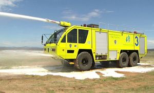
How do you make sure that large or oversize emergency vehicles are easily seen and quickly recognised? The answer is simple and straight forward – you paint the vehicle in a single colour and avoid using any complex marking patterns thus ensuring that any unusual shapes or features on the vehicle are visually linked together into a unified form. Complicated designs with different colours can actually add to viewer confusion and the vehicle becomes much harder to identify rapidly. Large or oversize vehicles operated by emergency agencies are often ladder trucks and Bronto skylifts, airport fire trucks or other special-purpose vehicles. I have been fortunate enough to be asked to redesign the livery and markings for two different oversize vehicle types including the Air Services Australia, Airport Rescue and Fire Fighting  (ARFF) Rosenbauer Mk 8 trucks located at twenty-one airports cross the country and the new ACT Fire Brigade (ACTFB) Bronto Skylift now operational in Canberra. Both vehicles are painted flourescent yellow/green with no patterned markings, the text has been limited and logo placement has been kept deliberately conservative.

ARRF Truck 2 - Air Services Australia - www.ambulancevisibility.com

Air Services Australia – Airport Rescue and Fire Fighting Rosenbauer Mk 8 painted fluorescent green-yellow with fluorescent/reflective waistline stripe and contour markings – note text and logos have been minimised.

Continue reading

Posted in Emergency vehicles, Fire, Fluorescent colours, High Visibility, Markings, Reflective, Rescue | Tagged , , , , , , , , , , , , , , , , , , , , , , , , | Leave a comment

Emergency Vehicles – Do not rely on sirens for an effective warning


When the Ambulance Visibility website was in its infancy over ten years ago one of the first webpages to be written was concerned with the inadequacies of sirens as an effective  warning for fire, police and ambulance vehicles. Stephen Solomon, David Green and De Lorenzo explained in their research that soundproofing in modern cars was becoming more efficient with each passing generation. Improved soundproofing coupled with louder radios and stereos, airconditioner noise and any wind or road noise inside the cabin was making it more difficult for drivers to hear an approaching emergency vehicle. In addition, the use of non-directional sirens made matters even worse, especially in cities with tall buildings and on roads with heavy traffic where the sound is reflected from many different directions. New ‘rumbler’ type sirens have been developed in an attempt to reduce these effects but with limited acceptance.

A US National Safety Council newsletter3 (April 1997, p1) reported on the results of a study by the American College of Orthopaedic Surgeons. The study demonstrated that the siren sounds of an ambulance proceeding at 100 kph barely precedes the ambulance, so that vehicles ahead of it cannot respond to its warning. The study showed that the distance for getting the attention of a motorist travelling at 100kph to be within 2 meters of the ambulance’s front bumper.

A new report published in the Accoustics Australia magazine last year tests and compares an Australian siren with a large number of international siren types including the Rumbler. The paper titled Accoustic Characteristics for Effective Ambulance Sirens and written by Howard, Maddern and Privopoulos from the University of Adelaide is a comprehensive examination highlighting the following points:

  • At 90 degrees to the forward axis (intersections) the siren may be approx half as loud.
  • “These results are consistent with Ref [37] that stating that the average siren attenuation, through closed-windows and typical masking noise, resulted in an effective distance of siren penetration of only 8-12 m at urban intersections, which is an insufficient distance to alert road users to safely clear the path.”                                      
  • The most practical location for the siren is on the front bumper.
  • Recommends a combination of current sirens + a low frequency rumbler.
  • A different urgency tone should be used when crossing an intersection or responding through traffic lights etc.
  • “The selection of an effective warning signal involves many competing factors that ultimately requires making compromises.”

Read the conference summary of the report – CLICK HERE

Read the report – CLICK HERE

I also came across a YouTube video recorded in Canberra that clearly demonstrates the lack of an audible warning inside a modern vehicle. The video shows a car travelling along a suburban road at about 80kph (50mph). Two AFP (police) vehicles approach from the rear (about 35 secs into the video) and the recording clearly shows how little warning time the sirens provide. The driver in the camera vehicle also lowers the volume of his stereo inside the car as he hears the police cars approaching. The second major issue is the increased likelihood of an unwanted event because the two police vehicles are travelling so close together. Drivers may see the first police vehicle but concentrating on the first they may not be aware of the second vehicle following closely behind.

More information on the Ambulance Visibility website under Sirens  and research links in the AV Reference Library   


Posted in Ambulance, AV Reference Library, Emergency vehicles, EMS, Fire, Police, Research, Warning Lights | Tagged , , , , , , , , , , , , , , , , , , , , , , , , , , , , , , | Leave a comment

Confusing high-visibility conspicuity pattern launched for motorways around Zurich


Earlier this year Leonardo Ferrazzi from Italy sent me this booklet titled Road Safety Inspectorate Signage. It outlines the details of a new conspicuity pattern now being used on the German high-speed motorways around Zurich. The booklet describes how the Canton of Zurich engineering department designed new reflective markings for their highway maintenance vehicles and protective clothing for their personnel. The new design uses reflective diagonal lines (overlaying layers of different colours on the vehicles) in trying to maximise visual contrast and conspicuity. Unfortunately the new markings and clothing designs compromise vehicle and staff safety by increasing visual confusion, slowing viewer reaction times and they display complex multicoloured diagonal patterns that completely disregard the common recommendations for maximizing vehicle and personal conspicuity. The main emphasis seems to be on the overall reflectivity and the “striking” impact of the new designs. 

The document explains that the new pattern is based on the existing striped chevron designs found on european motorways . The main explanation quotes “Development Studies show the risk of collision is 30 times smaller when a vehicle is equipped with retro-reflective sheeting.” This 30x smaller risk factor ignores the real-world need for effective colour and design parameters to be factored into the visibility and conspicuity equation so any complexity or confusion is minimised (see the AV Markings Toolkit) Continue reading

Posted in Emergency vehicles, Fluorescent colours, High Visibility, Markings, PPE, Reflective, Rescue, Significant & Important Blogs, Uncategorized | Tagged , , , , , , , , , , | Leave a comment

The Ambulance Visibility Marking Toolkit for Emergency Vehicles


After presenting at the Colorado 3rd Annual EMS Summit in 2010 I was asked to write several articles for the Colorado EMSAC Star. The first article in the series discussed the Ambulance Visibility ten-point toolkit for applying markings to emergency vehicles. EMSAC article - ambulancevisibilityblog - John KilleenThe article should be read alongside the presentation from the conference. The link is available on the AV website/Downloads or by clicking on the link below.

On Reflection – Thinking outside the box                      A toolkit for safer reflective markings – CLICK HERE

Posted in Ambulance, Battenburg, Chevrons, Emergency vehicles, EMS, Fire, Fluorescent colours, High Visibility, Markings, Police, PPE, Reflective, Research, SES, Significant & Important Blogs, Uncategorized | Tagged , , , , , , , , , , , , , , , , , | Leave a comment

Warning light guidelines for Fire, Police and EMS ambulance vehicles


After reading through a post on Elightbars about the excessive use of LED’s and viewing a video (embedded below), I thought it might be the right time to have another look at the warning light guidelines from Ambulance Visibility. Here is a brief summary of the eleven-point toolkit.

AMBULANCE VISIBILITY                                                                                                         Warning Light Guidelines for Emergency Vehicles

1. Attempt to standardise warning lamp colours: All the vehicles in your fleet should display identical lamp colours during response. A mixture of different colour combinations can confuse other drivers and slow their reaction times. If possible, rationalise your colours across the various agencies; In Australia, most of the police, fire, ambulance and rescue vehicles display red & blue warning lights, all based on research to maximise night/day performance.

2. Ensure effective warning lamp output both day/night: This point is really obvious for daylight; maximise lamp output to combat bright sunlight and promote long distance viewing. At night it may be necessary to dim lamp output to prevent excessive glare, although well-designed optics should reduce the extraneous light effects and glare to a minimum – see point 3. Continue reading

Posted in Ambulance, AV Reference Library, Emergency vehicles, EMS, Fire, High Visibility, Police, Warning Lights | Tagged , , , , , , , | Leave a comment

Off topic – EMS Week and the dark-side FDNY EMS poster


While I am in an off-topic mood, let’s go a bit further and have a look at the latest Fire Department of New York EMS Week poster. The poster for 2012 has produced mixed reviews about the impression it presents of EMS, especially around New York City. You can read the Rogue Paramedic and the SocialMedic blogs to get an idea. Comparisons have been made between the “dark side” of the NYFD EMS faceless medic poster being overdramatic, much like Batman in the Gotham City “Dark Night” theatre posters.

NY EMS week 2012
2012 poster
CLICK to enlarge

Firstly, I believe that National EMS week in the United States is a great concept and a similar style of promotional activity should be duplicated each year in Australia; possibly even as a joint arrangement between the two countries. Second, emergency response organisations like NYFD command large budgets that allow them to commit substantial funds to public relations projects. There are many smaller agencies that cannot even contemplate this level of PR funding so it is essential that the larger agencies take the lead. I am well aware of the trials and tribulations that have taken place between New York’s fire and EMS over the years but it is good to see the effort in producing the poster for EMS week. I believe 2012 is the third year running that NYFD has produced a national week poster. In all fairness, it is very difficult to photograph an image that communicates the humanity or reality of EMS. Therefore some poster years may well create better designs than others. Continue reading

Posted in Uncategorized | Leave a comment

Off-topic – Rare interview with Apollo 11 astronaut Neil Armstrong


I tend not to stray far from the conspicuity and visibility topic very often   But… if you are one of the baby-boomers like me, you would have lived through the Mercury, Gemini and Apollo space missions in the years leading up to the moon landing in 1969. I was 11 years old when Neil Armstrong stepped onto the moon and even after all these years I remember the air of excitement on the day. Classes at school were adjourned and we watched a fuzzy black & white TV image of man’s first steps on the moon.

CLICK to go to the Neil Armstrong interview
A screenshot from the Neil Armstrong four-part interview

It is very rare for Neil Armstrong to give interviews but the Certified Practicing Accountants of Australia in their 150th year celebrations managed to convince the retired astronaut to take part in a four segment interview lasting almost one hour. It is well worth watching the video to gain an insight into the man himself and to hear an in-depth commentary of the space race as history was being created forty years ago.

Watch the interview – CLICK HERE

Posted in Uncategorized | Tagged , , , | Leave a comment

A quick comparison of fluorescent reflective prismatic and engineering grade markings for EMS, police and fire vehicles


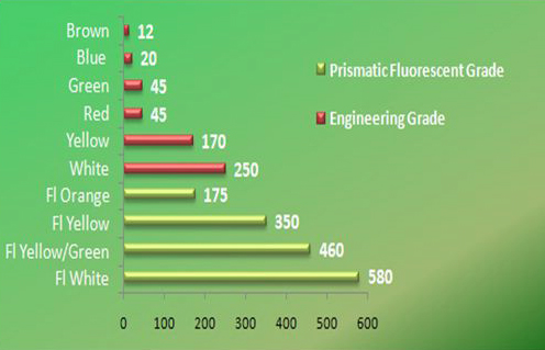
Have you ever thought about upgrading to fluorescent/reflective markings for your vehicle fleet? Most signwriters supply engineering grade reflective material unless you specify fluorescent/reflective grades that are manufactured with a layer of micro-prism reflectors. The well-known brands are 3M Diamond Grade, Reflexite Daybright, Avery Dennison MVP/prismatic grades and Nikkalite Crystal sheeting. The table below shows the difference in reflectivity between the glass-beaded engineering grade reflectives and the more efficient prismatic flourescent materials. The chart indicates the maximum values when measured from the ideal viewing position in relation to the different reflective materials available in the marketplace.

The chart is a simple guide for choosing colours and materials that will provide effective visual markings on your vehicles. You can see from the graph that brown and blue when seen alongside the other colours have the lowest reflective output. The fluorescent prismatics are more efficient but their viewing angle is narrow in comparison to the engineering grades. Despite this, the prismatics are usually the best choice for most emergency vehicles.

Reflectivity comparison - Fluorescent prismatic vs engineering grade

Approximate maximum reflection coefficient values for different types of coloured reflective materials (measured in candela/m2)

Posted in Ambulance, Emergency vehicles, EMS, Fire, Fluorescent colours, High Visibility, Police, Reflective, SES | Tagged , , , | Leave a comment

Why your paediatric [pediatric] ambulance transports deserve high-conspicuity safety!


I have a suggestion – go to Google images and type in pediatric ambulance (not paediatric ambulance for those of us outside the US that are using ‘proper English’).     Look at the images; you can count on one hand the number of ambulances on the page with high-conspicuity fluorescent markings.

Paediatric ambulance with mural larking layout

A paediatric ambulance displaying mural markings

Why then are so many hospital and EMS agency ambulances for transporting children covered with decorative murals, photographic body-wraps or crayola drawings. Almost all paediatric ambulances equipped with lights & sirens are fully capable of responding under priority conditions. It seems the common guidelines about emergency vehicle visibility and conspicuity have been conveniently forgotten by medical administrators when it comes to transporting our most valued and cherished family members; neonates, babies and children. Continue reading

Posted in Ambulance, Emergency vehicles, EMS, Fluorescent colours, High Visibility, Markings, Reflective | Tagged , , , , , , , , , , , , | Leave a comment

The difference between Battenburg high-visibility markings and Sillitoe chequers on Police, Fire & Ambulance vehicles


Almost every passing week sees another police, fire or EMS agency boasting  at a vehicle launch that their response vehicles are now displaying a new world’s best practise Battenburg high-visibility markings. The agency chief always adds that the latest change to the HiVis markings has only taken place after a lengthy consultation period with staff that has also included comprehensive safety research.

Superceded NZ Police markings

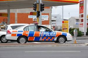
Hybrid markings - not high visibility, not Battenburg and not Sillitoe, rather more akin to camouflage - now superceded New Zealand police markings

Nine times out of ten, the new markings unveiled on the vehicle are not Battenburg and are in actual fact examples of Sillitoe markings. The Sillitoe chequers can often make the vehicle harder to visualise and the Sillitoe style of small-blocked markings are already being removed from emergency vehicles in a some countries around the world. There remains great technical confusion about the difference between Full Battenburg, Half Battenburg and the Sillitoe chequered marking.

Modified marking designs that fall between the true Sillitoe and Battenburg markings are ‘hybrid’ designs. The hybrids are usually designed by signshops or advertising agencies in an attempt to generate unique and eye catching marking schemes that prove their creative prowess. The hybrid designs are inevitably a patchwork of ideas sourced from other emergency vehicle colours and marking layouts from around the world. They are usually promoted as high-visibility, Battenburg or safety markings. Rarely do you hear of a new chequered vehicle design claiming its roots to be in the Sillitoe pattern. So what’s the difference between them? Here is a brief look at correctly identifying Sillitoe, Battenburg and hybrid markings.

Victoria police van in Sillitoe markings

Victoria Police (Australia) van in blue & white Sillitoe chequered markings

The Sillitoe chequered pattern has its origins in Scotland as the Sillitoe tartan which was adopted in black and white to identify the Scottish police. The pattern has been modified for use in a range of colours including blue for police, red for the fire brigade, red or green for ambulance and orange for the volunteer State Emergency Services in Australia. Police forces and other emergency agencies around the world have used the Sillitoe check for many years. The design is based on three lines of multiple small square blocks in alternating colours. The most common base colour is white which makes silkscreening or die cutting of the coloured squares very easy for signwriters. The squares are all equal in size and can be reproduced in a range of sizes. Continue reading

Posted in Ambulance, Battenburg, Emergency vehicles, EMS, Fire, Fluorescent colours, High Visibility, Police, Reflective, Research, SES, Significant & Important Blogs | Tagged , , , , , , , , , , , , , , , , | 2 Comments

ACT Ambulance reflective conspicuity markings in new medical EMS textbook


A quick post with just a bit of exciting news! 

Several years after designing the ACT Ambulance reflective markings I was approached by Cengage Delmar Learning publishing in the United States about supplying images for a new textbook. The authors, Richard Beebe and Jeffrey Myers had seen the latest ACT Ambulance reflective/fluorescent markings on the internet. They asked if they could include photos of the ambulance vehicles in the textbook: – The Professional Paramedic Series – Volume III: Trauma Care and EMS Operations.

ACT Ambulance reflective markingsThe images appear in the Visibility and Conspicuity section on pages 356-358 in the EMS Vehicle and Transport Safety chapter along with explanatory text about ambulance conspicuity during day and night. If you are interested in a bit more medicine than just the vehicle images supplied by Ambulance Visibility, you can always buy the book from all the usual retailers.

As usual, more information is available from the Ambulance Visibility website or              the AV Reference Library

Posted in Ambulance, Emergency vehicles, EMS, Fluorescent colours, High Visibility, Markings, Reflective, Research | Tagged , , , , , , , , , , , , | Leave a comment

The pink steamroller vs emergency vehicle colour and markings


A few days ago the morning started out normally. I was up early so while I ate breakfast I quickly browsed through the electronic version of the Sydney Morning Herald newspaper (SMH). One story with the headline The Pink Wash – Pink Ribbon Inc grabbed my attention. The article had been written by Alyssa McDonald and went on to say             “A new Canadian documentary shows how the devastating reality of breast cancer has become obfuscated by a shiny, pink story of success.” This story twigged my interest as many charities in Australia are now coming under increasing scrutiny about their methods of fundraising. The major issue is the payment of significant collection fees to the intermediate promoters who usually take a massive chunk of the donations in marketing costs. The suppliers selling the pink label commodities in this country are also taking flak about how little of their sales income actually translates into donations. Most of the comments written by readers at the bottom of the Pink Wash article generally supported the author’s point-of-view. The comments included a post from the CEO of a company that had recently agreed to donate money from the sales of a pink licensed product. She disclosed late in the post that she was now having second thoughts about both the pink logo promotion and the morality of the deal made with one of the several breast cancer organisations in Australia.

It was an interesting article…but a few hours later it was hurriedly removed from the SMH website without a trace  (see dead link above). This rarely happens so some of the home truths in the article must have really upset someone with enough shove to have the page pulled from view so quickly. A search of the SMH site revealed several Continue reading

Posted in Ambulance, Chevrons, Emergency vehicles, EMS, Fire, Fluorescent colours, High Visibility, Markings, Police, Reflective | Tagged , , , , , , , , , , | 1 Comment

Conspicuity for emergency motorcycles – Battenburg vs Fluorescent markings


Battenburg motorcycle markings

UK Police motorcycles with modified Battenburg markings causing camouflage effects

One of the first posts written in the early days of the AV blog was about the effectiveness of motorcycle conspicuity and markings during emergency response. A major part of that discussion was concerned with a growing trend in the UK to affix a modified pattern of Battenburg markings onto Police motorcycles . The fluorescent yellow and blue reflective chequered marking pattern was introduced by signwriting firms in the UK who re-configured the earlier Full Battenburg design affixed to police sedans to fit the compact size and curves of the nation’s emergency response motorcycles. This new hybrid livery, rather than enhancing police motorcycle conspicuity, actually decreased conspicuity by introducing  serious camouflage effects which easily break up the outline and form of the motorcycle. Continue reading

Posted in Ambulance, AV Reference Library, Battenburg, Emergency vehicles, EMS, Fluorescent colours, High Visibility, Markings, Police, Reflective, Research | Tagged , , , , , , , , , , , , , | Leave a comment

A conference, two papers and retroreflective conspicuity at night.


Conferences are a great opportunity to attend presentations discussing the latest research, to see the newest products and meet with colleagues. At the trade exhibits we are bombarded with sales pitches and a gambit of differing viewpoints. As a matter of course we tend to filter out all the sales talk and seek out the more reliable information coming from the determined battalion of sales reps with each rep looking to gain access to your agency’s valuable purchasing dollars.

After leaving the sales pavilion and returning to the presentations we tend to sit in the audience, drop our guard and become less selective about filtering the information coming out of each session. Some of the speakers are independent researchers but others are sponsored by their employer who more often than not, are a commercial business enterprise. Don’t get me wrong, commercial research has a lot to offer by delivering Continue reading

Posted in Ambulance, AV Reference Library, Emergency vehicles, EMS, Fire, High Visibility, Markings, Police, PPE, Reflective, Research, SES, Uncategorized | Tagged , , , , , , , , , , , , | Leave a comment

Emergency workers and HiVis clothing – our perception of safety may be dangerously flawed!


Just how how safe are we as emergency workers at an incident scene when stepping out onto the road ? Our on-road activities are an integral part of life in an ambulance/EMS, police, fire or rescue response. We pull-on a ‘safety’ vest or fluorescent jacket over our uniforms and then start work, trusting our lives to the passive conspicuity built into a piece of clothing that is specially designed and officially sanctioned  for use day & night in hazardous situations.

Over the years there has been a vast amount of detailed research undertaken, along with changing OH&S legislation and recent occupational education, all reinforcing that emergency workers can substantially increase their on-road ‘safety’ margin by wearing a fluorescent/reflective vest. Regardless, emergency workers should always concentrate on maintaining a high level of situational awareness at incidents and never, ever turn their back on traffic. As a group, all workers have been repeatedly reassured that protective clothing continuously radiates a spectrum of colour enhanced conspicuity through 360 degrees. I too have been guilty of always believing in this dictum (albeit somewhat nervously and with occasional reservations) but after reading a recent email sent by Malcolm Palmer, I am not so sure anymore! Continue reading

Posted in Ambulance, AV Reference Library, Battenburg, Emergency vehicles, EMS, Fire, Fluorescent colours, High Visibility, Police, PPE, Reflective, Rescue, Research, SES, Significant & Important Blogs | Tagged , , , , , , , , , , , , , , , , , , , | 4 Comments

Ultrabright warning lights – never a brilliant idea for safety!


Last week I received an email from David Green urging me to read a new post from the Police Inspector Blog. The posts are written by the popular and accomplished book author  who writes in the UK under the Inspector Gadget nom-de-plume.  The blog is headlined ‘When practitioners are not consulted’ and goes on to discuss what happens when the people in charge of procuring the new national standard police vehicles forget to talk to their patrol officers about the equipment selected? Follow-up articles have been published in the Mail Online and the Telegraph newspapers.

Police Accident scene

Police accident scene

It comes as no surprise that issues surrounding vehicle and equipment procurement programs result in ongoing problems for the thousands of  response agencies scattered across the globe.  The Gadget blog discussion lists five vehicle equipment issues that have caused problems locally for the Inspector and his colleagues. A reprint outlining the issue of overly bright warning lights in point five is as follows : Continue reading

Posted in Ambulance, Emergency vehicles, EMS, Fire, High Visibility, Police, Rescue, SES, Significant & Important Blogs, Warning Lights | Tagged , , , , , , , , , , , , , , | 5 Comments

Denver Paramedics add enhanced ambulance markings


Denver Paramedics - New ambulance contour markings

New reflective contour, door and hatch markings fitted by Denver Paramedics

Immediately after the 3rd Annual EMS Safety Summit held in Denver CO, Denver Paramedics retro-fitted enhanced reflective markings to their ambulance fleet. White vertical and baseline contour striping were added to the patient care compartment to clearly outline the ambulance body at night. The white reflective tape cannot be seen during daylight and therefore does not detract viewer attention away from the solid vehicle profile during the day. Under headlamp illumination at night, the contour markings along with the new door and hatch markings offer a clear image of the ambulance especially when the doors are open on the roadside.
The Denver changes are a great example of an inexpensive and easily completed retrofit that delivers a substantial increase in vehicle and crew safety during day-to-day ambulance operations. More information is available on the Ambulance Visibility website.

Posted in Ambulance, Chevrons, Emergency vehicles, EMS, Fire, High Visibility, Markings, Police, Reflective, Research | Tagged , , , , , , , , , , , , , | Leave a comment

Ambulance Visibility website and AV Blog statistics for 2011


The yearly visitor statistics are in for 2011, They show that both the Ambulance Visibility website and the AV Blog have received over 50,000 visits between them during the 12 months. Much of the credit must go to the new AV Reference Library that for the first time brings together comprehensive links to the latest visibility /conspicuity research as well as other research resources from around the world.

The many documents and articles provided by David Green last year have been very popular as downloads, as have other several other documents sent in by Malcolm Palmer from the UK and Johan Granlund in Sweden. The Ambulance Visibility website continues to sustain a trustworthy and reliable knowledge base with detailed links to an ever-increasing library of international resources.

Stay tuned for some new additions in 2012; there will be an increasing emphasis on the new directions being taken within European conspicuity, plus a sure-be-controversial new discussion commentary that compares many different emergency vehicles and their marking layouts. As always, you will be kept up-to-date with current research and the latest news.

Thank you to all on the web who have taken the time to have a look at one or both of the Ambulance Visibility sites during 2011.

All the best for 2012 –  John Killeen

Posted in Ambulance, AV Reference Library, Chevrons, Emergency vehicles, EMS, Fire, Fluorescent colours, High Visibility, Markings, Police, Reflective, Rescue, Research, SES, Significant & Important Blogs, Warning Lights | Leave a comment

Announcing the new Ambulance Visibility Reference Library


Ambulance Visibility Reference Library Logo_www.ambulancevisibility.com_John Killeen

The Ambulance Visibility Reference Library logo

It has always been exceptionally difficult to find accurate research without spending hours searching the internet.


The new Ambulance Visibility Reference Library brings visibility and conspicuity research documents and information together in the one place for the first time. The AV Reference Library provides links to a multitude of relevant documents and reports, including a large number of studies and articles that have not been previously available on the internet.  The important research work of David Green, an Australian engineer who was at the forefront of visibility and conspicuity research for emergency vehicles between 1970 and 1990 appears on the internet for the first time.

David Green’s research papers provided guidance to State and Territory emergency service organisations across Australia for many years with his studies and articles remaining an important cornerstone of vehicle conspicuity practise to the present day. You can read copies of his work CLICK HERE.

Documents and studies are catalogued in broad categories by subject and this makes the library resource very easy to use. New documents will continue to be added to the library over the next few weeks. Try the AV Reference Library for yourself – CLICK HERE

Posted in Ambulance, AV Reference Library, Battenburg, Chevrons, Emergency vehicles, EMS, Fire, Fluorescent colours, High Visibility, Markings, Police, Reflective, Rescue, Research, SES, Significant & Important Blogs, Uncategorized, Warning Lights | Tagged , , , , , , , , , , , , , , , | Leave a comment

Chevron enquiry from Pikesville Fire Department


Pikesville Fire Department Rear Chevrons

Upright chevron V markings on a Pikesville FD vehicle

In late November 2010, I received a blog comment from Capt. John Berryman from Pikesville Fire Department asking the following question about using upright chevrons on the rear of fire appliances rather than the inverted-V pattern. John also forwarded a photo of a Pikesville fire truck.

“Sirs, could you please reference any problems with using a standard V pattern for the reflective chevron markings on the rear. Not the inverted V pattern. Our department has installed a V pattern on the rear of one of our larger trucks and have come under question as to why. Somewhere a while back I read that the standard V pattern draws you attention to the standing vehicle much better then an inverted V pattern. Can you explain. Thanking you in advance.”

Thanks John – Here is a copy of my reply:

Background to chevrons                                                                                                             Your question about upright V vs inverted V rear facing chevrons is not an easy one to answer. The earliest wide scale use of a large standardised chevron pattern took place in the UK when the Police forces placed them on vehicles in an attempt to reduce the incidence of rear-end collisions when police cars were stopped on motorways. This early chevron was a precursor to the Battenburg conspicuity marking designed a few years later. Continue reading

Posted in Ambulance, Battenburg, Chevrons, Emergency vehicles, EMS, Fire, Fluorescent colours, High Visibility, Markings, Police, Reflective, Research | Tagged , , , , , , , | 2 Comments

Fire Rescue News – 70s throwback: Lime-yellow fire trucks fade out


Pinellas Park Fire Department has decided to change vehicle colour from yellow-green to deep red according to an article written by Anne Lindberg in The St Petersburg Times and reflects the personal view of at least 60% of the department’s firefighter’s. Subsequently, a second article,  published around the same time in Fire Rescue News (FRN)  is another genuine example of the growing trend for emergency services to uphold the traditionalist view to ignore and sublimate proven research. There is little doubt that the Pinellas Park firefighters are sincere in their choice to return to deep red coloured fire vehicles. Continue reading

Posted in Ambulance, Chevrons, Emergency vehicles, EMS, Fire, Fluorescent colours, High Visibility, Markings, Reflective, Research | Tagged , , , , , , , | 1 Comment

Emergency vehicle chevrons – the AV Blog series Part 2


Welcome back to Part 2 of the Chevron Blog.  This part will discuss the following topics:

  • Chevrons on current and future vehicle fleets
  • Current fleet markings with chevrons on different vehicle styles
  • Differing expectations of Police, Fire & Ambulance
  • Battenburg and chevron markings
  • Chevron colour

You may well ask; why all the fuss about fitting chevrons to vehicle fleet?  This single basic aspect is often overlooked when the time comes to decide about appling chevrons to all the different vehicles in your fleet. In some cases the move to fit chevrons is a voluntary decision within one organisation. In other situations it may affect a complete industry; this was the case when the NFTA in the United States recommended all fire appliances be fitted with chevrons that cover at least 50% of the rear-facing profile.

This type of blanket requirement may have a few implications for some agencies but can present a difficult set of problems to others. In the case of the NFTA, the area of coverage was set at a minimum 50%, which was appropriate and allowed flexibility for the layout of the chevrons to fit different vehicles. If the coverage requirement had been set at 90%-100% then the recommendations would be impossible to implement by some fire departments because the unusual design of their vehicles would not allow the full coverage required.     Continue reading

Posted in Ambulance, Battenburg, Chevrons, Emergency vehicles, EMS, Fire, Fluorescent colours, High Visibility, Markings, Police, Rescue, Research, Significant & Important Blogs, Uncategorized, Warning Lights | Tagged , , , , , , , , , , , , , | 2 Comments

Emergency vehicle chevrons – the blog series Part 1


Ambulance Visibility LogoChevrons have become the latest new look in safety markings on emergency vehicles. Regardless of whether you love chevrons or hate them, the inverted-V markings will be displayed on even more Police, Fire and Ambulance vehicles every day. The numbers will increase regardless of the results found in any investigative studies. Chevrons will continue to be fitted to vehicles and this will be due more to popularity than the presence of reliable research.

The key question: Is the use of chevrons effective and good practise?
Chevrons have been affixed to UK Police vehicles since the early 1990’s. They were officially adopted as an element of the Battenburg design which was researched and designed in the UK by The Home Office.  Most of the Battenburg research was focussed on the contrasting squares displayed along the vehicle sides – the extra yellow & red chevrons were then literally tacked onto the backend of the chequered design. After the UK Police adopted Battenburg, the markings were later embraced by the ambulance and some fire services in Britain. The last decade has seen selected emergency service agencies throughout the world slowly begin to introduce chevrons on their fleets. These posts will hopefully offer some clarity about chevrons and aid in making an informed choice about fitting them to fleet vehicles.   Continue reading

Posted in Ambulance, Battenburg, Chevrons, Emergency vehicles, EMS, Fire, Fluorescent colours, High Visibility, Markings, Police, Rescue, Research, SES, Significant & Important Blogs | Tagged , , , , , , , , , , , , , , , | 5 Comments

Enhancing motorcycle conspicuity – emergency response & at the roadside.


Ambulance Visibility LogoLast week, I was at an intersection in Sydney waiting for a red light to change. Off to the left and without warning, a white blur appeared in the corner of my eye.  It took several seconds to recognize what was happening but by then the motorcycle had weaved its way across two-thirds of the intersection. The bike sped out of view; a blue masthead lamp mounted on the rear of the bike flashed – just once. The motorcycle rider, a Police Officer, was responding to an emergency call. There was no wail of the siren to be heard inside my car, no other timely warning; more important, there was no obvious indication that the bike was an emergency vehicle.

Police motorcycles with Sillitoe markings

Police motorcycles with Sillitoe markings

The police motorcycle was engaged on a vital task; but painted bare white and travelling at high-speed it looked just like many other motorcycles found on the road (image at right). The blue chequered bands and the miniature police badges visually morphed into an indistinguishable blur. Small complex patterns can have the same effect – even turning some designs into camouflage (see image left below). Both the chequered and the miniature permutations of the Battenburg marking scheme are remarkably effective in breaking up the bike’s visual profile (especially when the bike is seen from the front). All this significantly increases the time taken by drivers to detect and recognise a motorcycle on response duty, thus reducing the valuable time they need to avoid the bike.       Continue reading

Posted in Ambulance, Battenburg, Emergency vehicles, EMS, Fluorescent colours, High Visibility, Markings, Police, Significant & Important Blogs, Warning Lights | Tagged , , , , , | 3 Comments

Chevron markings on Emergency Vehicles – the blog series


Ambulance Visibility LogoHave you ever wondered why inverted V chevron markings are appearing on emergency vehicles?  Is there any science behind the coloured patterns? These questions and many more will be answered in a series of blogs covering all facets of chevron markings; The series begins on Tuesday 1 June 2010. The posts will be published over 14 days in 5 episodes and the blog will be open for questions and comments. The series will discuss a range of factors including Chevron pros & cons, preferred layouts, chevrons & camouflage and the types of vehicles that should not use chevron markings + much more.  If you are considering rear-end protection, then this blog series should not be missed!         Here is the link to the series.   

Chevrons

Chevrons - All your questions answered

Posted in Ambulance, Chevrons, Emergency vehicles, EMS, Fire, Fluorescent colours, High Visibility, Markings, Police, Research, Significant & Important Blogs | Leave a comment

Lets clear up the confusion about reflectivity and vehicle waistlines!


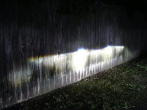
Ambulance Visibility LogoThe last few months have seen me answering  questions (more than a few times) about one of the recommendations listed as an opportunity in the FEMA Emergency vehicle visibility and conspicuity study. This one statement about reflective material has caused as much debate as the full report itself. The report advises: “Concentrate retro-reflective material lower on emergency vehicles to optimise interaction with approaching vehicles’ headlamps.” This is a simple piece of advice that recognises the sharp horizontal light cut-off found in the headlamps of modern vehicles. In basic terms; if you park a car at night so it is pointing at a wall a short distance away, then you will see that the lower part of the wall is brightly illuminated and the upper part of the wall is still relatively dark. The level of the cut-off line varies with the height and size of the vehicle, but not by much.

Headlamp cut-off on wall

Headlamp cut-off displayed on wall

This sharply defined headlamp cut-off has serious implications for reflective signage mounted at a high levels above the roadway. This problem also affects large emergency vehicles like fire trucks and some taller ambulances. The companies that market reflective products have responded by developing new high-intensity (high reflectance) materials that use microprism technology to increase the level of reflected light. These improved materials are designed to compensate for the distinct light cut-off and operate more efficiently at lower illumination levels than the earlier beaded types.       Continue reading

Posted in Ambulance, Emergency vehicles, EMS, Fire, Fluorescent colours, High Visibility, Markings, Police | Tagged , , , , , , , , , , , | Leave a comment

Link to an inspiring book written by Dr Stephen Solomon


Ambulance Visibility

Here is a really good read especially if you seek top-class information on emergency vehicle visibility and safety and it’s now free. When I was working on my first research report in the late 1990’s this was often quoted as one of the major textbooks of the time. The book “Emergency Vehicle Accidents – prevention and reconstruction” written by Dr Stephen Solomon was required reading for anyone looking for information on visual anatomy & physiology, vision, vehicle colour, markings, warning lights and sirens plus much more.    

ARFF yellow-green Fire Vehicle www.ambulancevisibilityblog.wordpress.com
Photo courtesy of Air Services Australia

Stephen Solomon has probably retired by now but he was responsible for the ground-breaking research study demonstrating that yellow-green fire appliances are involved in less accidents than two-tone red & white appliances. He went on to champion the use of fluorescent colours and contour markings on emergency vehicles.    

In 1997 I bought a copy of the book from Amazon and the price was over $100. The full version of the book is now available free online at Google Books. I would recommend that you read it soon as possible, I do not know how long the full version will remain accessable. The original edition was updated by Solomon and Paul Hill in 2002 after they added extra content.  If you like the book then buy a copy at Amazon.com for approx. $50. 
Well there’s the heads up – go now, read the online book!

Posted in Ambulance, Fire, Fluorescent colours, High Visibility, Police, Rescue, Research, Significant & Important Blogs, Warning Lights | Tagged , , , , | Leave a comment

Welcome to the brand new AV Blog


Ambulance Visibility LogoThe Ambulance Visibility Blog will give up-to-date news and information on emergency vehicle visibility and conspicuity as soon as it becomes available. Unlike the news page on the ambulancevisibility.com website this blog will include comments, photos and videos from John Killeen but also comments and replies from around the world. The news will still be updated, but it will remain as formal report. Until then have a look at my website www.ambulancevisibility.com for more detailed information. Stay on board and see what develops over the next few weeks…..

Posted in Uncategorized | 2 Comments